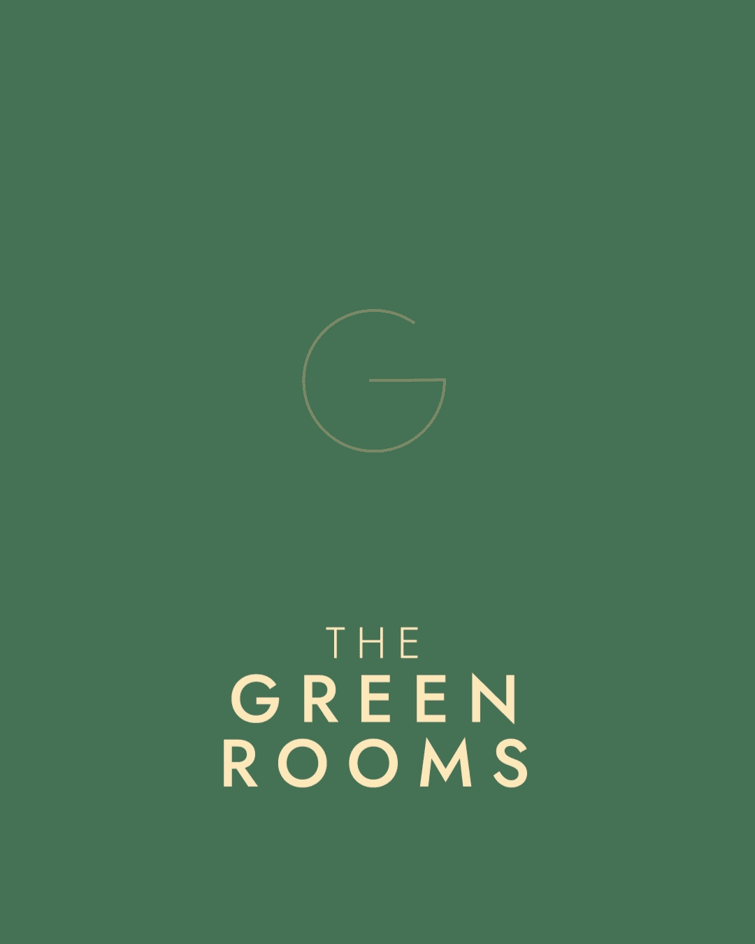
The Green Rooms is a B&B and social enterprise in Margate with seven bedrooms and an event space that’s open and available for community-minded projects. It is the passion project of the founder that combines Margate’s natural beauty with her passion for the environment and food – bringing all that together to create a place where people can have a wonderful stay while knowing they’re contributing positively to the future of Margate, the community and the world.
In our initial workshop, Sam mentioned the strapline she’d come up with: Bed. Breakfast. Beautiful. The logo and visual language was inspired by the strapline: Bed. Breakfast. Beautiful. Taking this into my concepts, the clear winner was a linear logo which encompassed all three, and went on to define the visual language for the brand. Taking influence from their stained glass windows, I also combined these with elements of the logo, and created a suite of seamless geometric patterns, to be used across anything from social posts to wallpaper.
Deliverables:
Visual identity and logo design
Brand guidelines
Social media templates
Logo animation
Working with Life Size, I designed the new brand and website for Monitorfish, who help overcome the challenges in sustainable fish farming with their state of the art camera and monitoring technology.
The bold graphic device was inspired by the triple lens on the camera, simultaneously evoking waves and movement. To complement this, a finer and more subtle suite of graphics were created as nod to their monitoring software data visualisation.
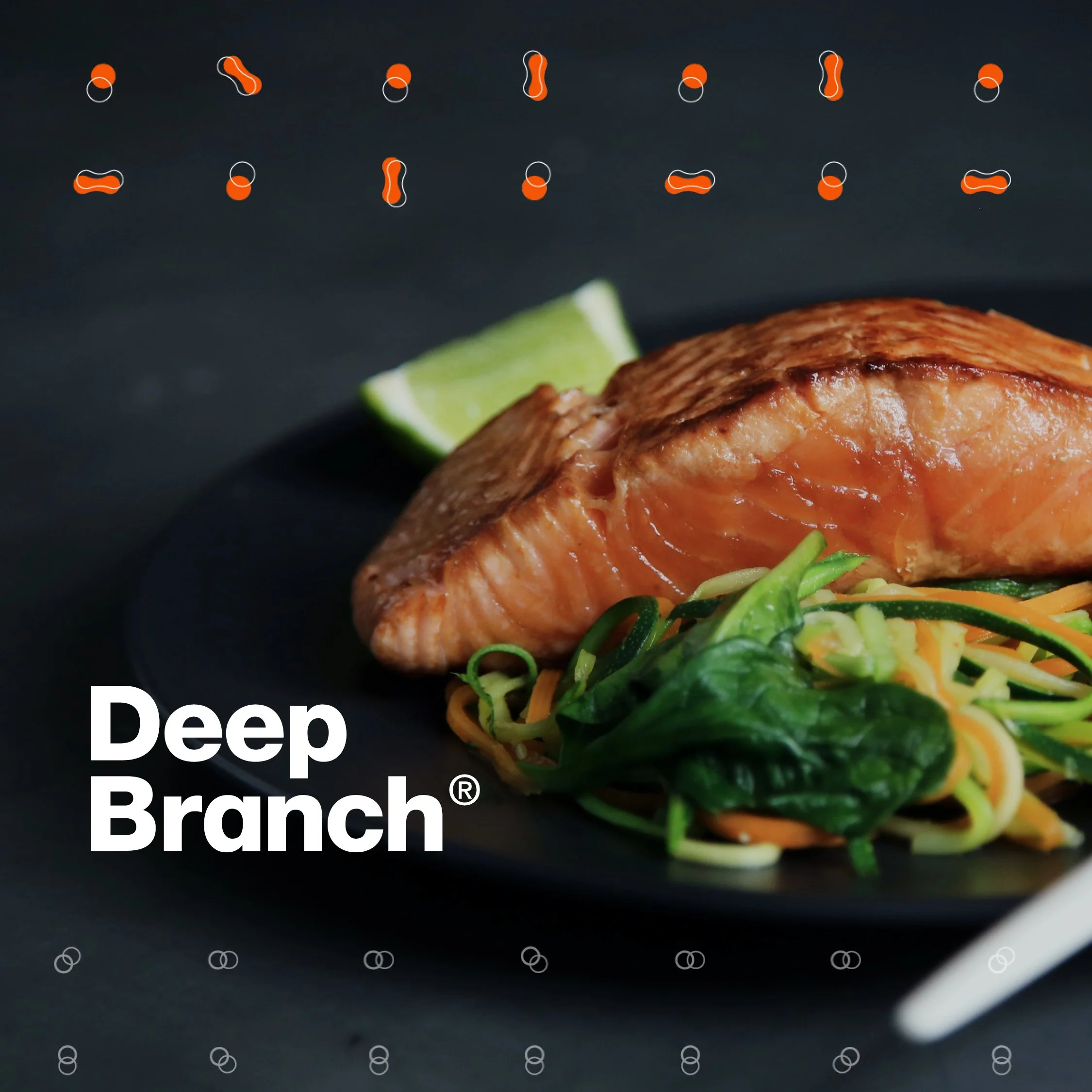
Rebrand for Deep Branch, who use clean and renewable carbon and energy sources to create ingredients for a more sustainable food system.
Their first product is Proton, a single-cell protein created by a unique gas fermentation process. Using fermentation and the three gases involved as inspiration, I created a suite of continuous patterns and graphic elements to create a clean and vibrant visual identity.
I designed the new brand for the British Nutrition Foundation, who were keen to position themselves as the leading public-facing nutrition charity in the UK. Working with Barley, we created a fun and vibrant identity, resonating with a wider audience - rather than specifically focussing on academia.
Recently I had the pleasure of working with Wild Up Slow Down to create their visual identity. The brainchild of two working mums experiencing the perpetual juggle of life and work, they created WUSD to help others slow down and reclaim their mental health with the power of nature.
The result of the mood boarding and concepts stages was a typographic logo with some illustrative touches. The earthy colour palette was complimented with a series of hand drawn icons, and a photography style focussing on interaction with nature. For the launch I developed a suite of illustrative social templates and holding site.
Website design for Kiwigrid.
During the coronavirus crisis, I worked with the British Red Cross on their social response, creating illustrative posts offering advice and tips to help the public through.
Branding / print and web design / infographics
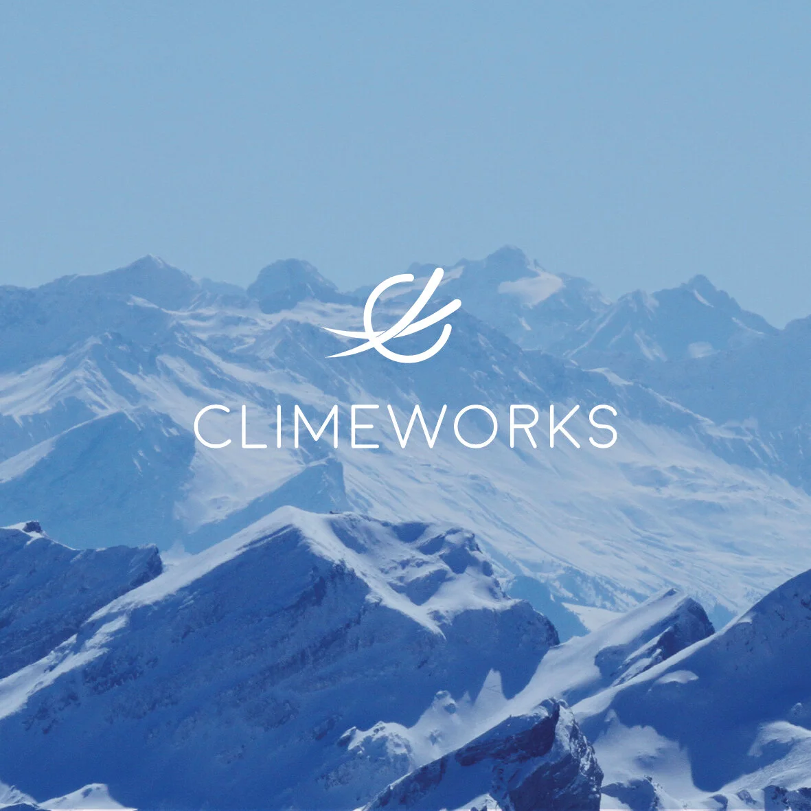
Climeworks are fighting the climate crisis with their revolutionary carbon removal technology. The first of its kind, their plants extract CO2 directly from the air to supply commercial markets such as food and beverage, greenhouses, and carbon-neutral hydrocarbon fuels and materials.
Following one of their brand workshops I was asked by cleantech heroes Life Size to work with them on the rebrand and other deliverables. Climeworks are all about their innovative technology, but their audience are not necessarily engineers. Simple designers like me need to understand what they do. Starting with their logo – a simplified reference to the filtration and air streams – we carried this reference through to a photo and graphic treatment, and then onto icons and infographics. Located in Switzerland, we also wanted to reflect the pure Alpine environment, after all, their technology is quite literally cleaning the air we breathe.
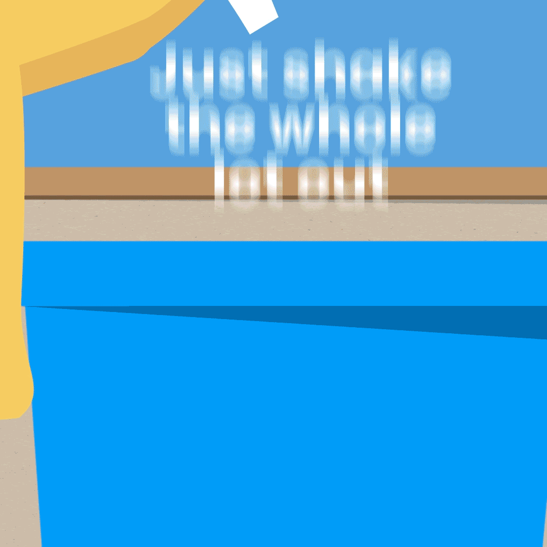
Collaborating with Barley, I worked on the #Shakeitout campaign for Suffolk Waste Partnership. The aim was to reduce recycling contamination, an issue which was causing 28% of recycling to be rejected at a cost to both councils and the environment.
Essentially it was a task in behaviour change, focusing on areas like flats where the contamination was higher. The idea was to discourage people from throwing bagged waste into their recycling, and keep it clean dry and loose.
Once Barley had the idea of #shakeitout, they asked me to design the campaign identity and with it create a toolkit including illustrations and guidelines and downloadable assets. I then created a suite of digital posters, print ads and lorry livery.
But the hero of the campaign was the playful rework of the Hokey Cokey, which I illustrated and animated, and was used across social and digital channels, as well as cinemas across the county.
Working with Shelter to implement their powerful new brand over a series of fundraising events.
The Something Green Wedding Fair was run by the North London Waste Authority, aimed at helping brides and grooms-to-be to select more sustainable, yet sophisticated, options for their wedding. I created the identity, brochure, infographics and social graphics.
Illustrative strategy design for British Red Cross.
Website and brochure design for the iconic Leadenhall Market.
Produced with Barley.
A suite of fun, and playful social graphics and web design to promote the RSPCA’s Big Animal Lottery.
Agency Arthur London
Branding / Print and web design
I recently wrapped up my rebrand for DMI (Development Media International) who deliver media campaigns through radio, TV and mobile to change behaviours, promote health and save lives in developing countries.
New visual identity, guidelines, report and brochure styles and graphic brand posters depicting health, contraception and malaria.
Branding / Web design / Infographics
KPS have developed innovative kite based system, capable of producing cheap and most importantly clean energy. But they needed a brand to match, so I was asked to work with cleantech heroes LSM.
We developed a photography style and colour palette inspired by the dramatic Scottish landscape they operate in, and a logo and graphic style derived from the kite patterns and bridle system.
Save the children ambassador and model Adwoa Aboah was so inspired when she went to Uganda on a field trip with friend and photographer Felix Cooper, she organised a fundraiser in London for 200 friends and faces from the fashion and music world.
The events team asked me to work with them to create a lock up, look and feel and numerous deliverables for the event which raised £345,000 on the night.
Aveley Court is a development of luxury homes Kent. I was asked by Concept Foundry to create an identity for the marketing of the development. I aimed to reflect the exclusive, yet rural nature of the properties, and reference the Western Red Cedar exteriors.
They all sold, so guess I did my job…
Annual report for Engineers Without Borders UK.
When I’m not creating for clients, I try and time find time for my own creations. Whilst I enjoy experimenting with different styles, I have most fun when I’m bringing to life the thousands of doodles from hundreds of meetings which litter my notebooks.
Over the last three years I’ve worked with Save the Children on their hugely successful Christmas Jumper Day campaign. I’ve been involved with everything from concepts, brainstorming and guidelines, to the design and delivery of countless fundraising, direct marketing and digital assets.
Last year Christmas Jumper Day raised £3.7 million.
As part of their centenary celebrations, Save the Children hosted a garden party attended by Her Royal Highness, The Princess Royal and 200 supporters. I was asked by the events team to create an identity and design the supporting materials.
Hosted at the Royal residence, Frogmore House in Windsor we took inspiration from the lilies and pond in the stunning gardens.
Brochure, including infographics, outlining Engineers Without Borders UK's strategy for the coming year.
Infographics, posters, emails and more...
The British Lion mark we see stamped on 90% of eggs produced in the UK is a symbol of quality and safety, due to the Lion Quality Code of Practice most egg producers adhere to. I’ve recently designed the current Code of Practice, as well as infographics, point of sale posters and marketing emails.
Lion Egg projects produced with Nexus PR.
A series of posters designed to communicate the breadth of Save the Children’s work. The challenge was to encapsulate all the great things Save the Children provide into powerful design, yet not detract from the striking photography.
Once we had settled on the 'word cloud' concept, I spent many hours with the writers and picture editor trying to source the perfect images to work with the typographic design.
Life Size are the cleantech communication specialists. I regularly work with them on design projects for their clients. In turn, they became the client when they asked me create their logo and identity.
First on the First formed in 2016, with the aim to encourage both men and women to check themselves on the first of the month for the early signs of breast and testicular cancer. I worked with them to design their logo and brand elements.
Working with Lambeth Council, I designed this brochure outlining their key asks for the Mayor of London to improve lives for their residents.
I worked on the concept and brochure design for the Emergency challenge, a unique fundraising event from Oxfam. Corporate teams from across the UK go head to head, responding to high pressure emergency scenarios faced by Oxfam staff in disaster situations.
Produced with PGA Branding.
Engineers Without Borders UK deliver workshops in schools on the subjects of power and water, and how engineering can play a part in renewable energy sources and the availability of clean and safe water in the developing world.
My brief was to create child friendly identities for both subjects, and a suite of design elements and illustrations for the work packs and presentation materials.
Identity and brochure for Macmillan, giving supporters the opportunity to donate to the charity through their wedding day.
Produced with Burnett Works.
Design for Macmillan’s Night In, an annual fundraising event encouraging participants to donate the money they would usually spend on an evening out, and instead spend a night in with friends.
I worked on the microsite and the kit, including materials such as a postcard book with cocktail and recipe suggestions, and personalised garland.
Produced with Burnett Works
Save the Children wanted a way to promote emergency fundraising among younger people. I designed this kit, sent to fundraisers, which includes promotional posters and leaflets, a guide book, t-shirt and collection tin. All the necessities to go out and fundraise when emergencies strike.
I recently designed this set of marketing emails for Air New Zealand, aimed at welcoming, data capture and retention.
Charity RedR UK have an annual event when they encourage workers, supporters and fundraisers to wear Red to work for one day. They wanted a lighthearted and fun logo to use across web and print materials to promote the day.
KnowledgePoint is a site where aid workers go to seek free and fast technical advice. Partnered with organisations such as Water Aid, RedR and Practical Action they have more than 150 technical experts, including humanitarian and development workers, private sector professionals, and academics who specialise in emergency-related issues, waiting to offer their advice and guidance.
KnowledgePoint asked me to redesign their logo and work on their overall branding, including the website which is currently being developed.
When there is a humanitarian crisis occurring, Save the Children are often at the forefront of awareness and fundraising. In recent years I’ve worked with them on their swift responses to the Gaza conflicts, elaborated on here in Creative Review. More recently, I was heavily involved in the refugee crisis response.